Above: A watercolour painting of a building in Kensington.

Above: A charcoal drawing of the monumental stairs at the Museum of Sydney

Above: Watercolour painting of the Museum of Sydney. I chose to depict the height of the office building amongst other features such as; the sandstone layering, the glass cube and the level changes.

The interior of the electrical engineering building looking onto the outside.

Above: Different views of a watercolour painting of a chair with a hoodie slumped on its back support. This was superimposed with a depiction of an hourglass.

Above: A watercolour and ink painting of entangled strips of water stuck tape.

Above: Homework from the first week of the workshop. The drawing depicts a wine glass with a candle in it and a semi-broken glass behind it being balanced on a plastic plate on top of a bed.

Above: Outside the Civil Engineering building looking over the library.


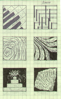
Above: Drawing exercises from our first class.

Above: The "layers" of my folder. The sheet of grey card in between the black and white sheets of card, acts as a barrier to seperate the charcoal drawings from the watercolour drawings. It is grey in colour because it is the tone between black and white (the "colours" used in this workshop).

Above: The backside of my folder. Charcoal on white card.

Above: The front side of my folder. When I think of movement I immediately think of human form. I thought the above image to be representational of my understanding of movement. White chalk pastel on black card.
 Above: A watercolour painting of a building in Kensington.
 Above: A charcoal drawing of the monumental stairs at the Museum of Sydney
 Above: Watercolour painting of the Museum of Sydney. I chose to depict the height of the office building amongst other features such as; the sandstone layering, the glass cube and the level changes.
 The interior of the electrical engineering building looking onto the outside.
 Above: Different views of a watercolour painting of a chair with a hoodie slumped on its back support. This was superimposed with a depiction of an hourglass.
 Above: A watercolour and ink painting of entangled strips of water stuck tape.
 Above: Homework from the first week of the workshop. The drawing depicts a wine glass with a candle in it and a semi-broken glass behind it being balanced on a plastic plate on top of a bed.
 Above: Outside the Civil Engineering building looking over the library.
 Above: Drawing exercises from our first class.
 Above: The "layers" of my folder. The sheet of grey card in between the black and white sheets of card, acts as a barrier to seperate the charcoal drawings from the watercolour drawings. It is grey in colour because it is the tone between black and white (the "colours" used in this workshop).
 Above: The backside of my folder. Charcoal on white card.
 Above: The front side of my folder. When I think of movement I immediately think of human form. I thought the above image to be representational of my understanding of movement. White chalk pastel on black card.


 Obama's space is a hovering phenomenon. It has a brooding feel of omnipotence for those who rise and take Obama's path, a straightforward one comprising of many opportunities yet not any obstacles, a metaphor for his quick rise to the top. The function of his office space is the campaign he is about to run and therefore his space consists of two identical seminar rooms for meetings and his consultants, as well as a large outdoor assembly hall.


